More than an address.
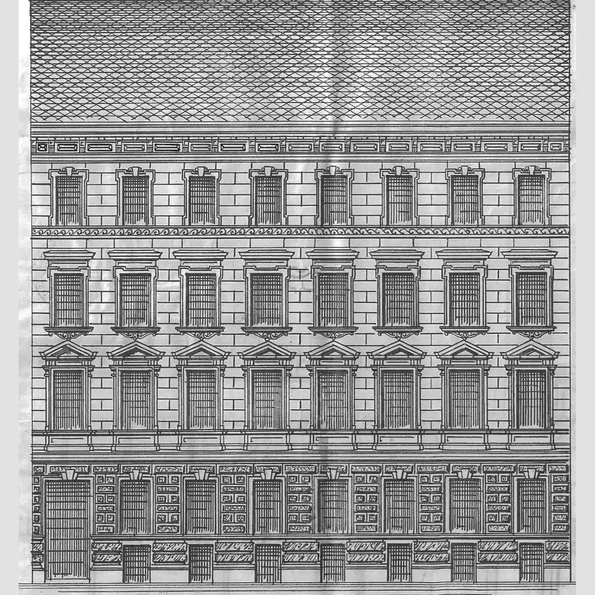
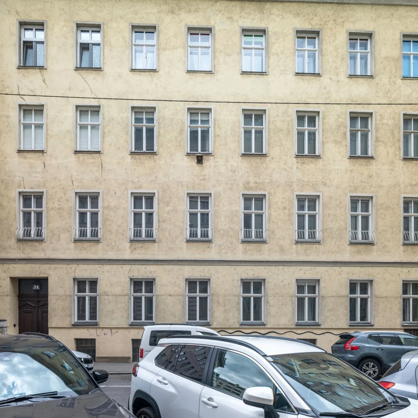
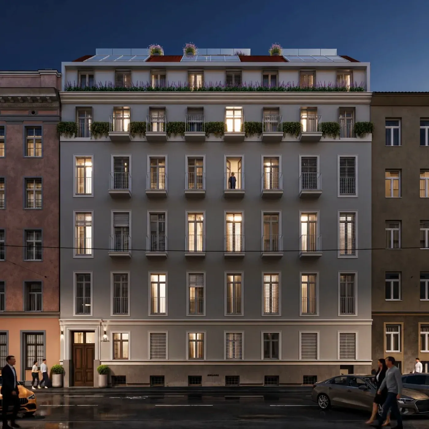
It didn't start with a logo but with the house itself: the elevation from 1862, the façade today and the view after the renovation.
These three states of the same façade became the heart of the website. Keep scrolling and the house travels through time.
Where leather turned to silk.
The house stands in the old tanners' quarter. As early as the 16th century, the Weißgerber – white tawers – settled here, turning plain hides into fine, supple leather. The finest of all was glacé leather, so soft it recalls silk, the leather of the famous kid gloves, Glacéhandschuhe.
That became the name: Glacé for the craft of the quarter, 54 for the house number.
Glacé 54
gla·céFrench: glossy, smooth. The finest leather of the white tawers.
Leather, stone and ink.
A classic serif with an italic 54, as if embossed in leather. An ink blue, the warm terracotta of the stairwell and a soft cream. Calm, refined and as timeless as the house.
Glacé 54
Rooms that don't exist yet.
The renderings of the house are not ours. Our part was bringing them to life: from the still images of façade, apartments and roof terraces we made short films that show the house lived in, long before the renovation begins.
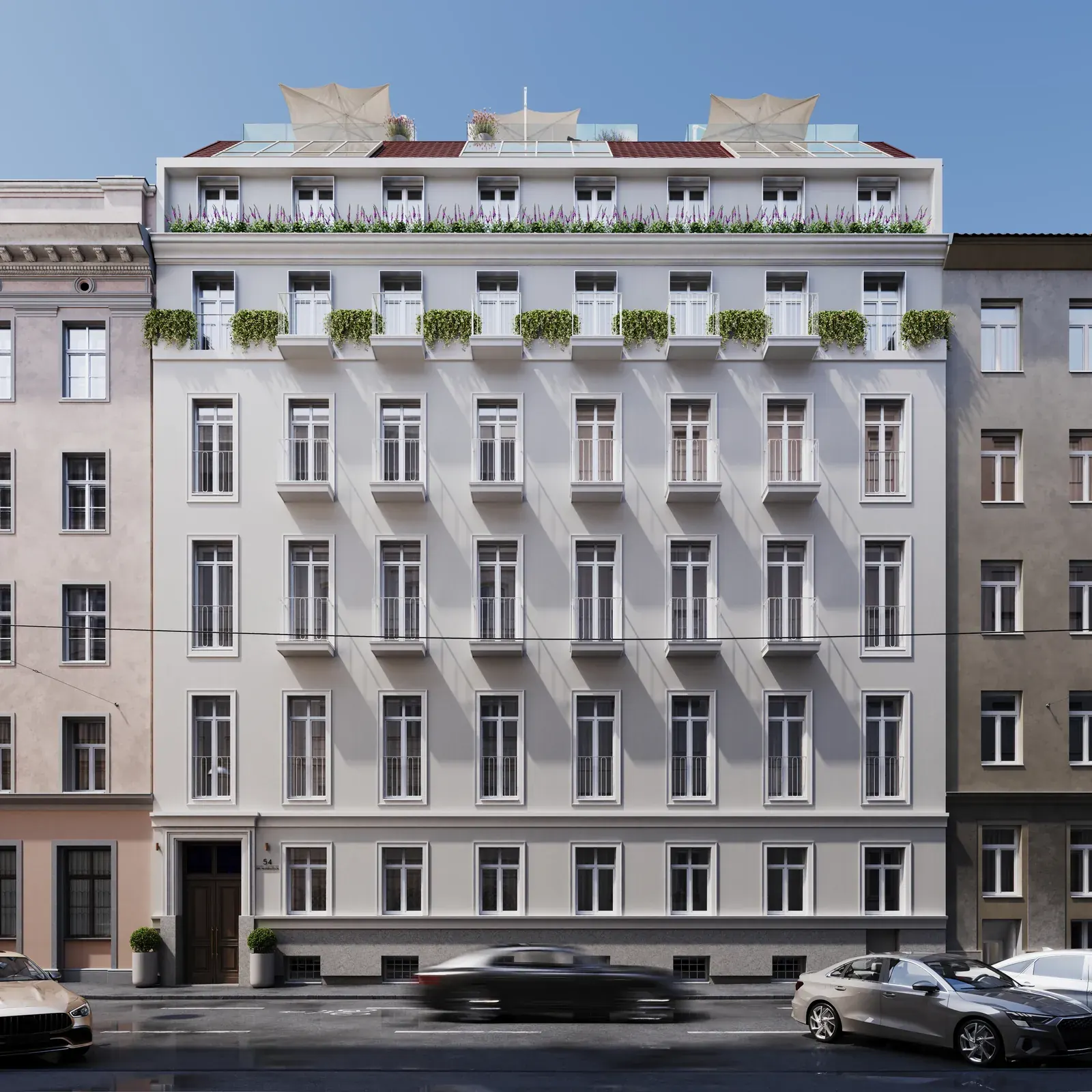
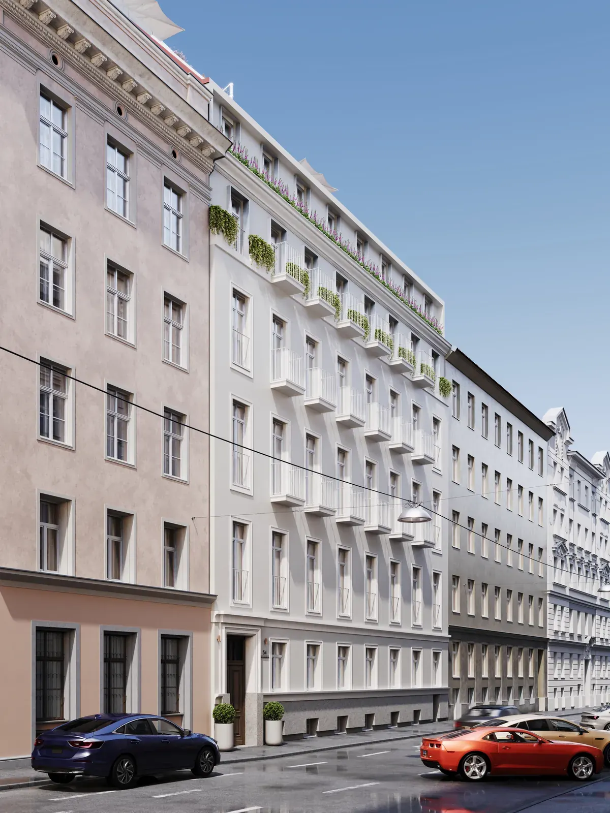
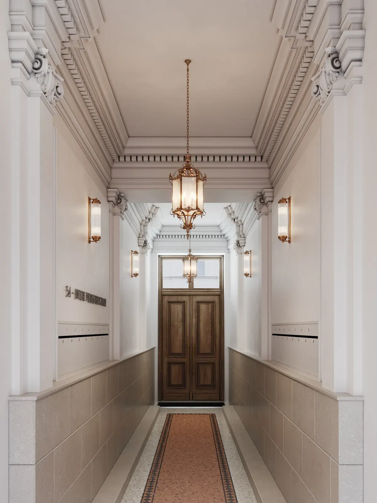
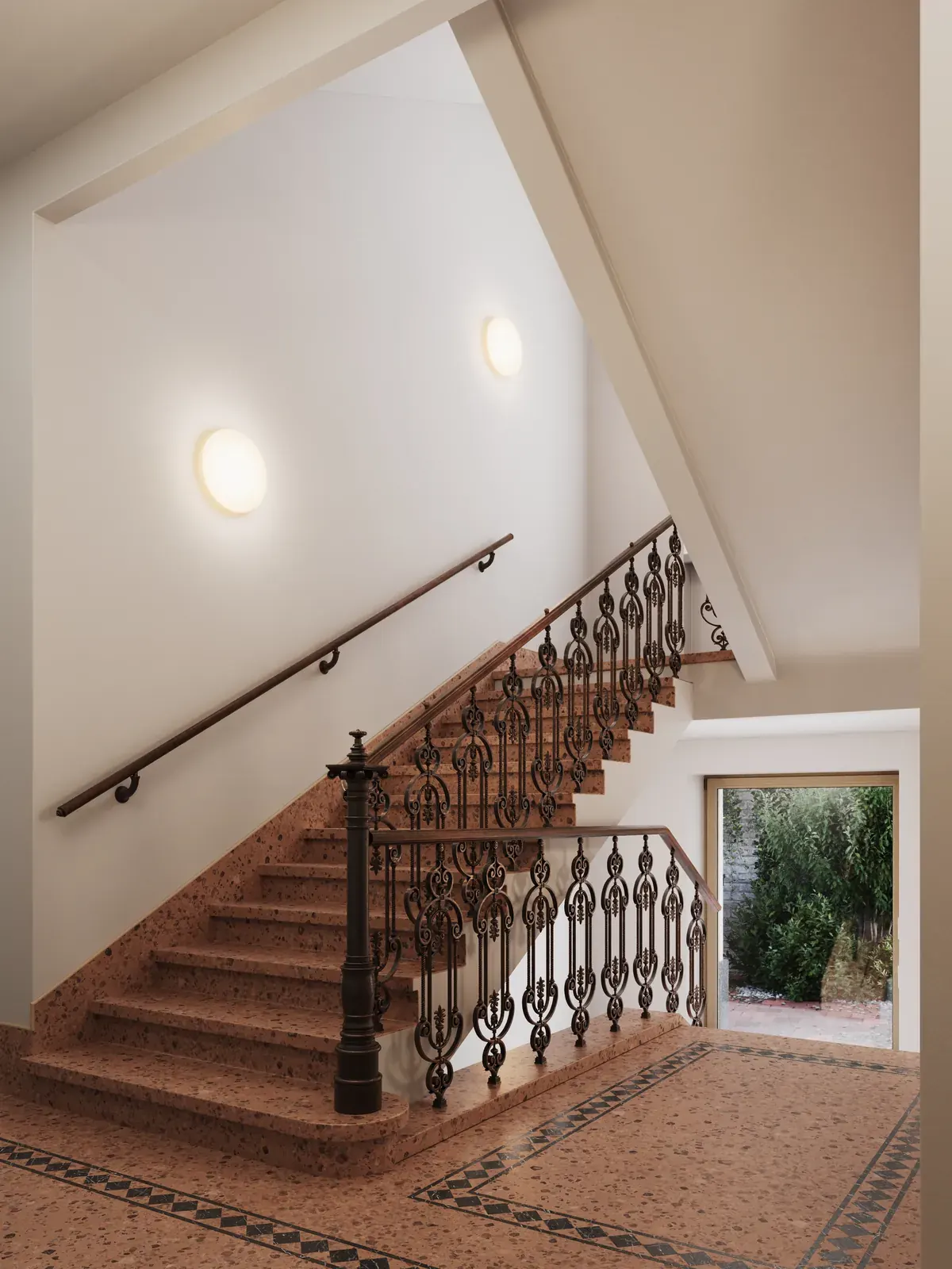
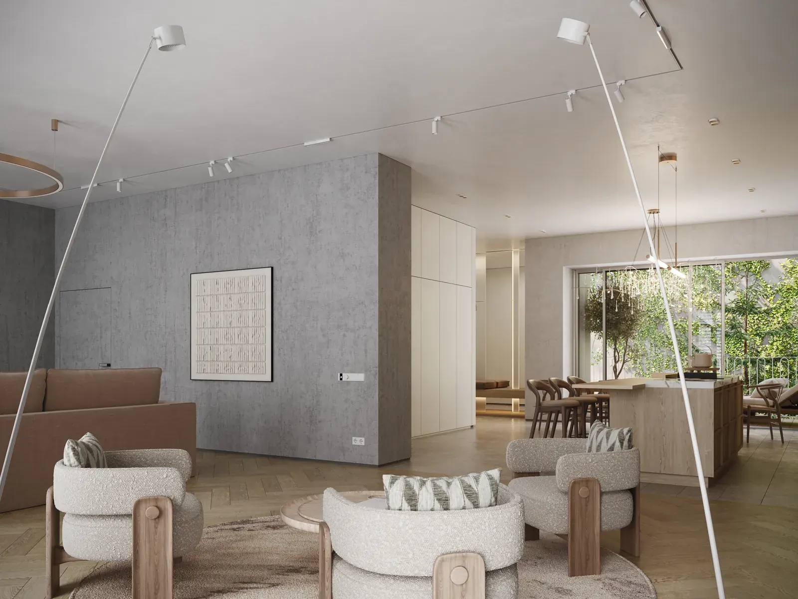
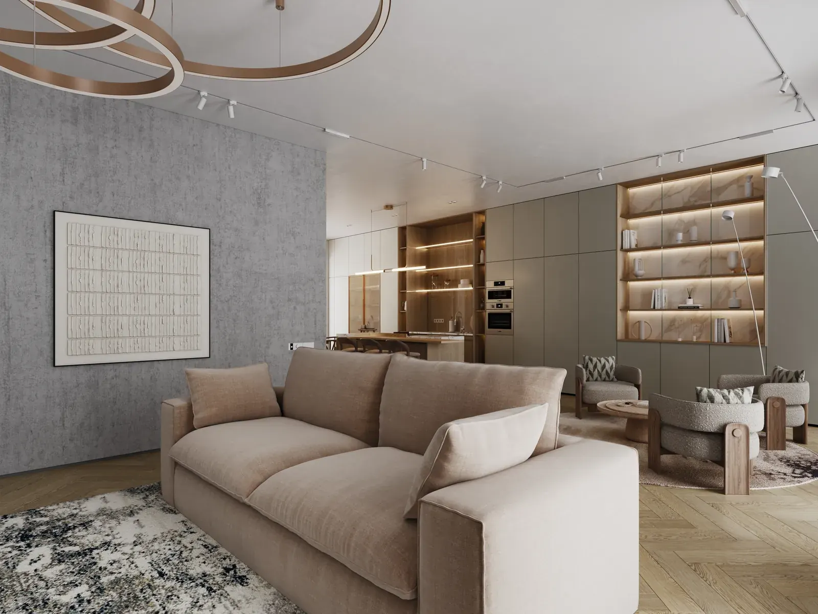
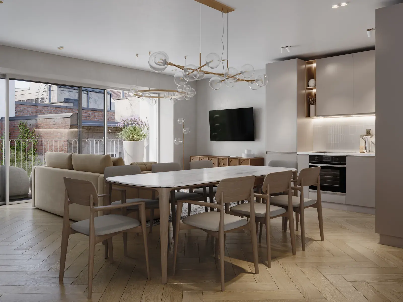
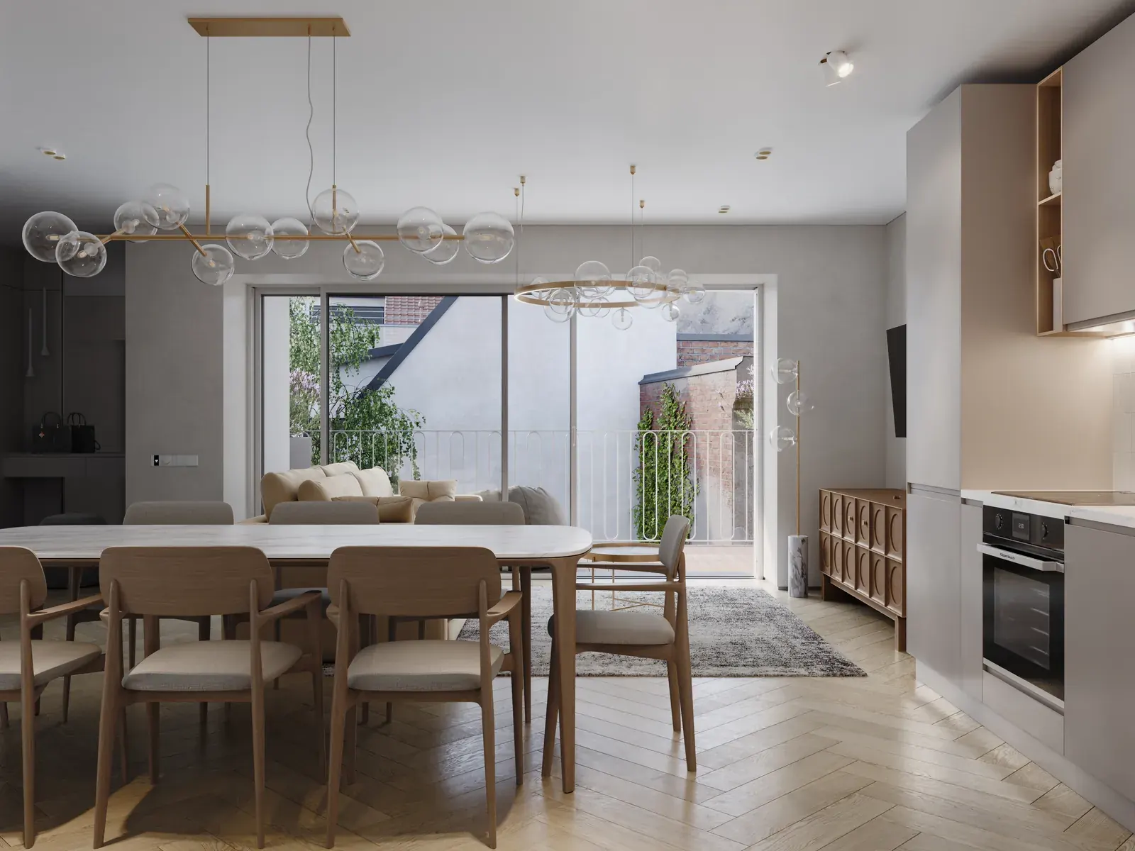
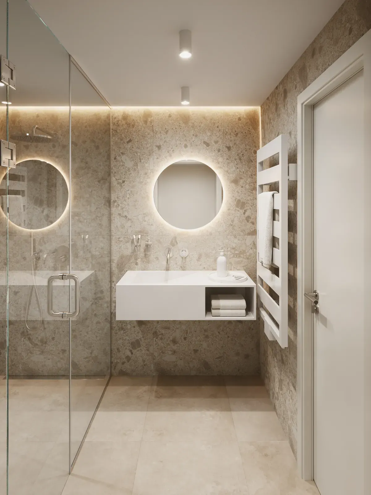
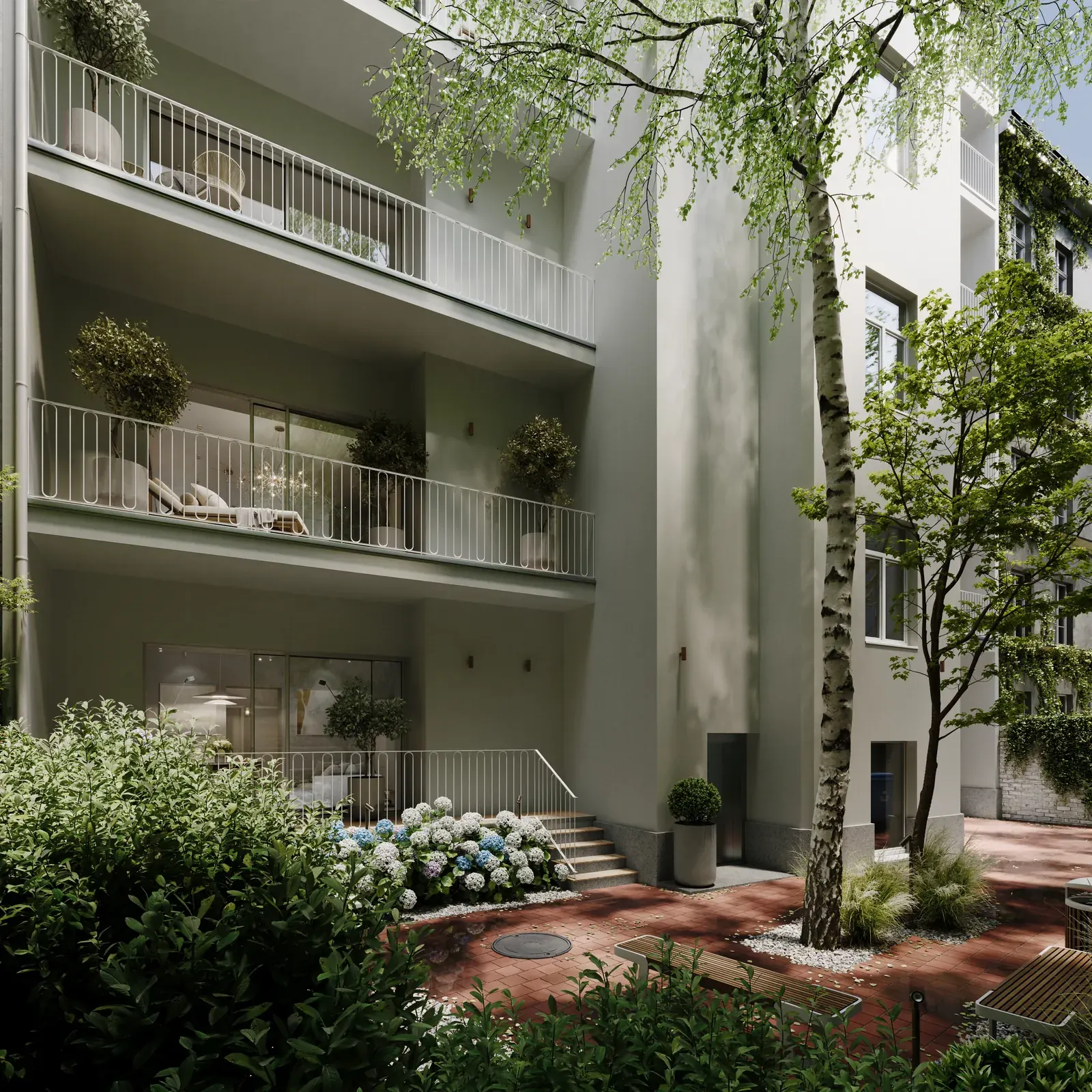
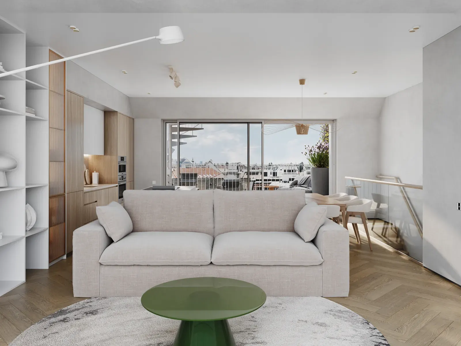
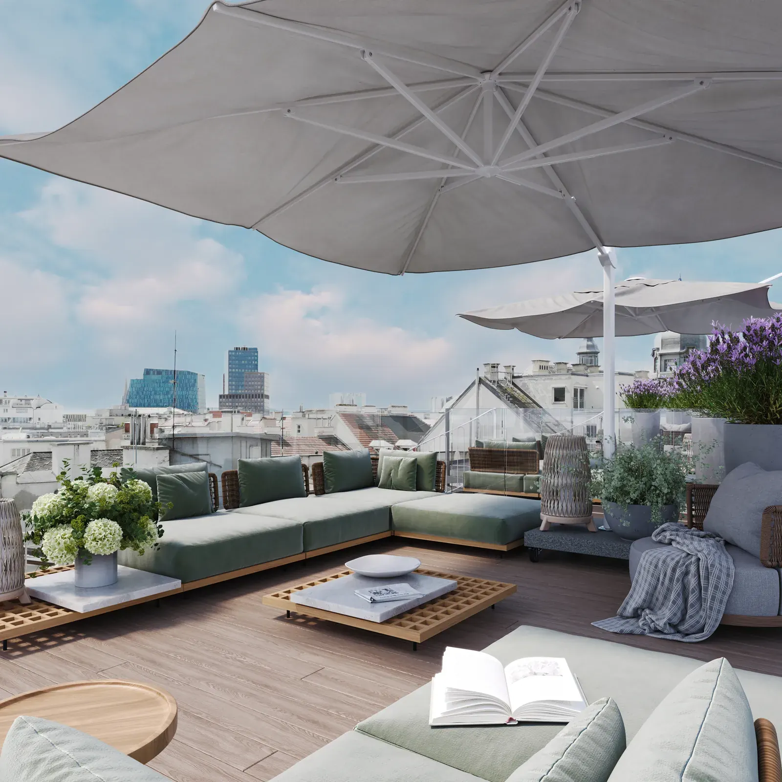
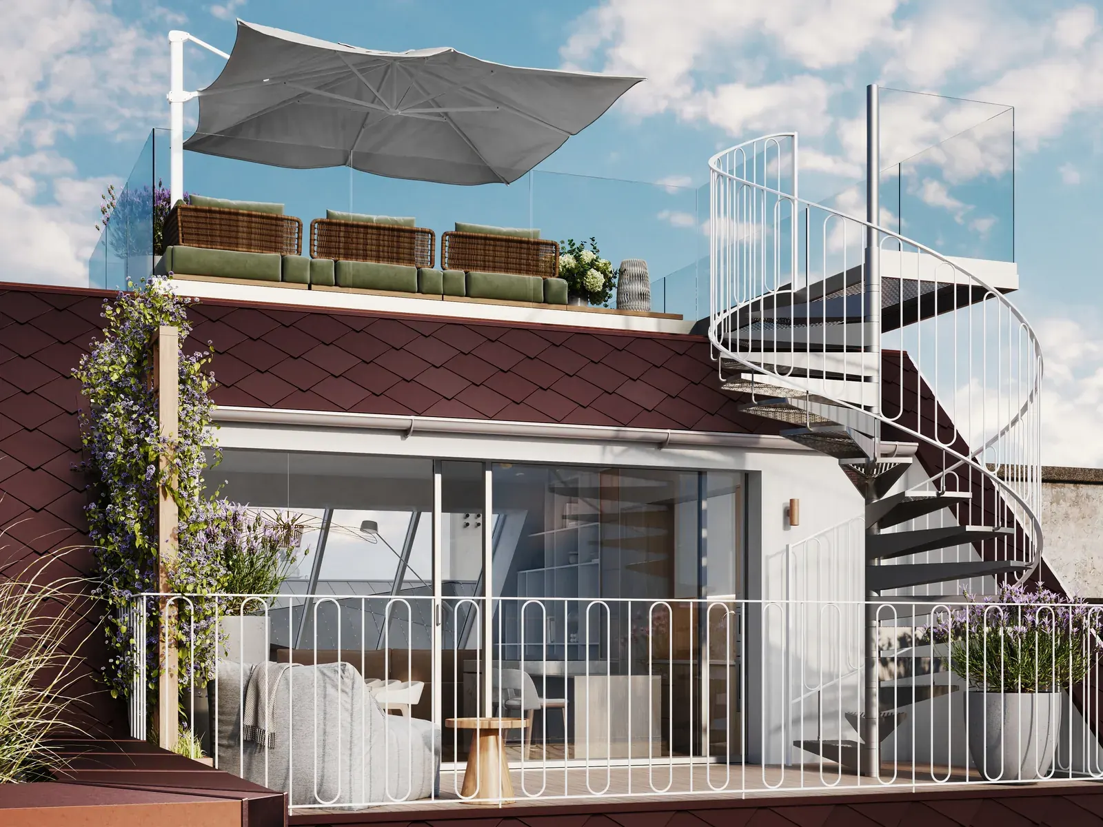
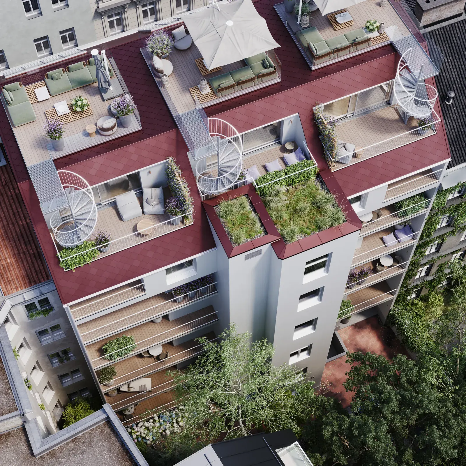
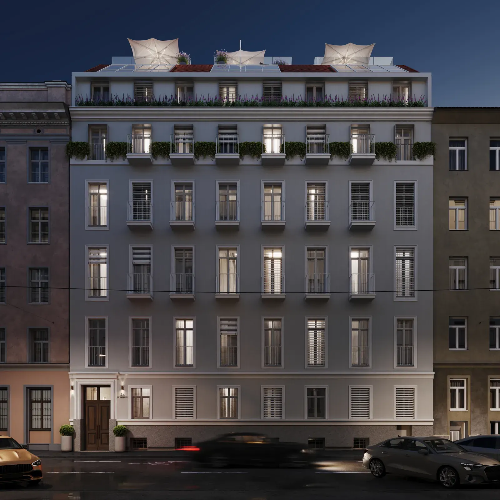
Renderings provided by OPF
A brochure like the house.
For the sales launch we designed the brochure. On the cover, the large 54 in the terrazzo of the stairwell, set on ink blue; inside, it tells the story of the quarter, the house and life between canal and park, in the same calm tone as the brand.
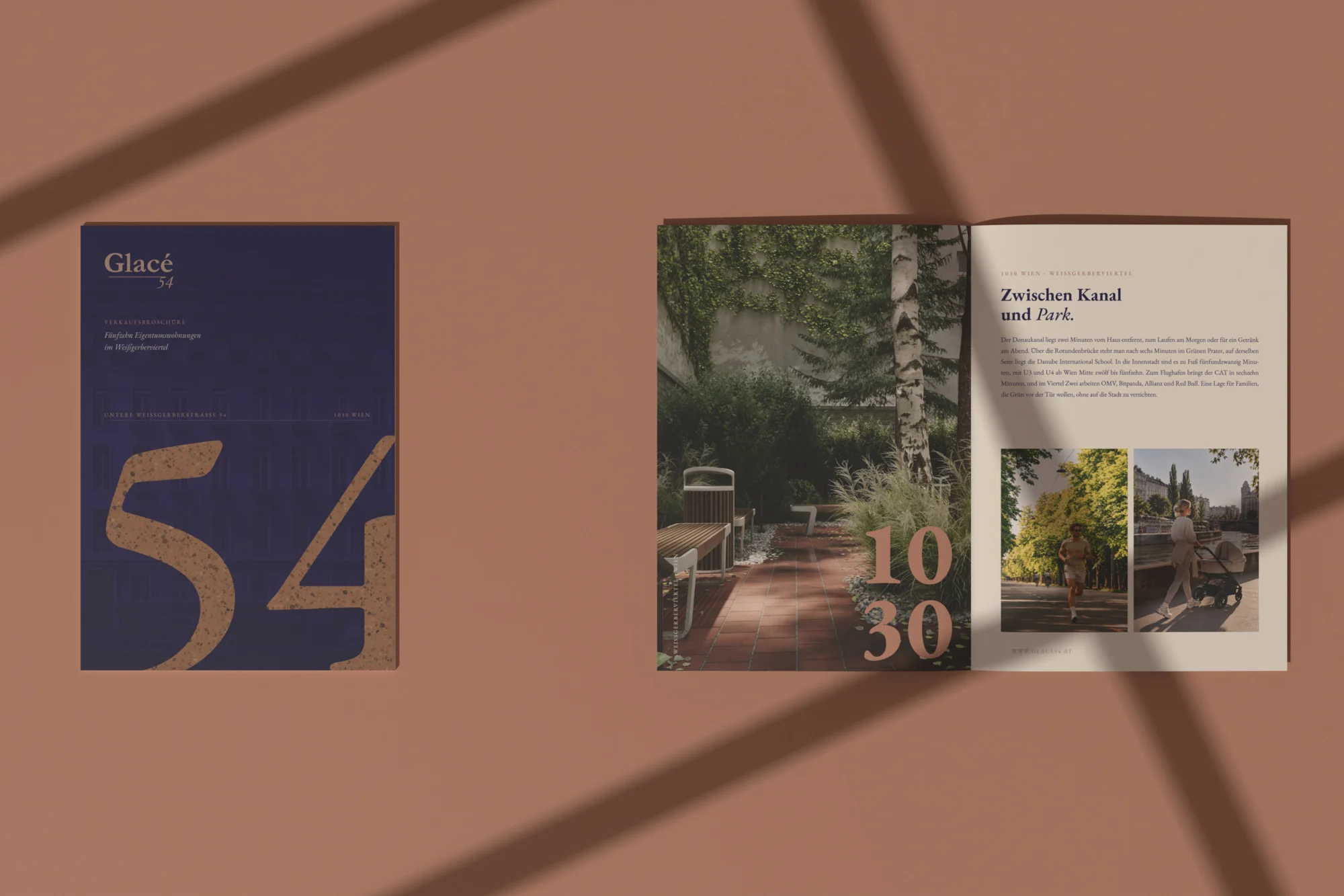
Between canal and park.
For the website we built a custom location map: in the brand's colours, without third-party labels, the house at the centre and around it the places that shape everyday life in the neighbourhood, each with its own icon and walking time. Zoom in and the walking routes appear; one tap turns the neighbourhood 3D.
Map data © OpenStreetMap · OpenMapTiles · OpenFreeMap
glace54.at
A bilingual website that feels like the house: calm, with room to breathe. The façade travels from 1862 to 2028 as you scroll, films and gallery show the rooms, the map the neighbourhood. Plus dedicated pages for city apartments, family apartments and penthouses.
An address becomes a brand.
Research, name, logo, video renderings, print materials such as the sales brochure, and the website: all from one studio, all in the same tone.