How a cinnamon bun became a brand.
A bakery that does one thing: cinnamon buns. For Cinnella we created a custom typeface and the logo, the imagery, storefront and interior, a website and the packaging.
- Brief
- Type & logo
- Imagery
- Storefront
- Interior
- Website
- Packaging
This is what the brief said.
Cinnella is a bakery crafting exceptional cinnamon buns. Baked fresh throughout the day in small batches, the shop pairs soft, pillowy dough with organic cinnamon, rich caramelised butter, and the best seasonal glazes.
The brief asked for boxes and branding. We went further: what does the brand smell like, what does the shop look like, how does the website feel? That added imagery, storefront, interior and a website.
Letters fresh out of the oven.
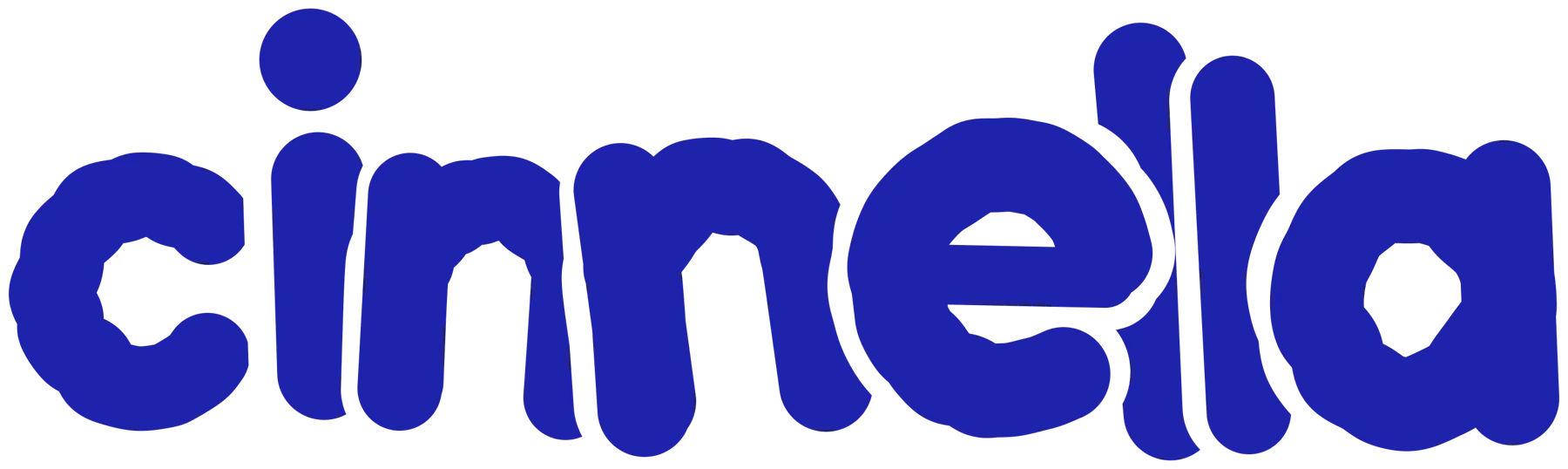
The idea came from the baking tray: buns that rise so close together that they stick, and that you then pull apart. That is exactly how the letters are built. Round, soft, lowercase and set so tightly that they touch.
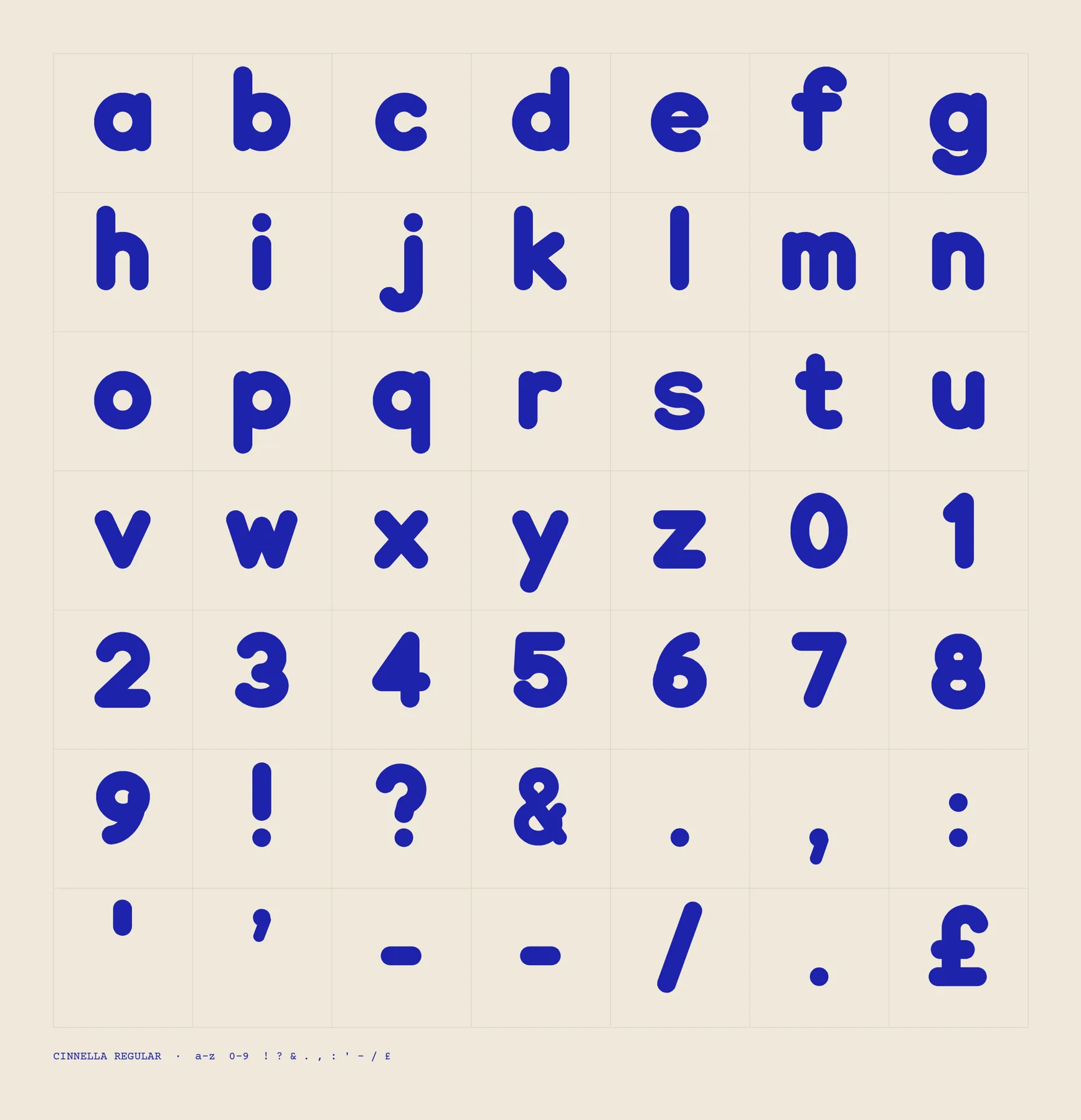
The logo grew into a complete typeface, Cinnella Regular, with every letter, figure and punctuation mark. So the brand works everywhere, from the neon sign to the menu.
Pictures you can smell.
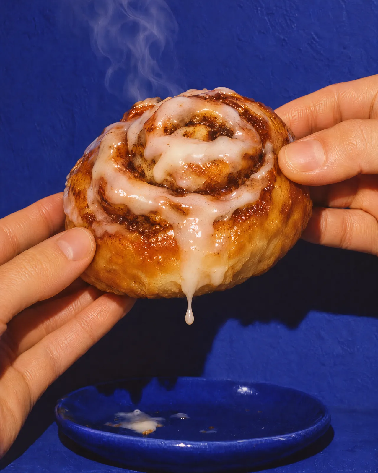
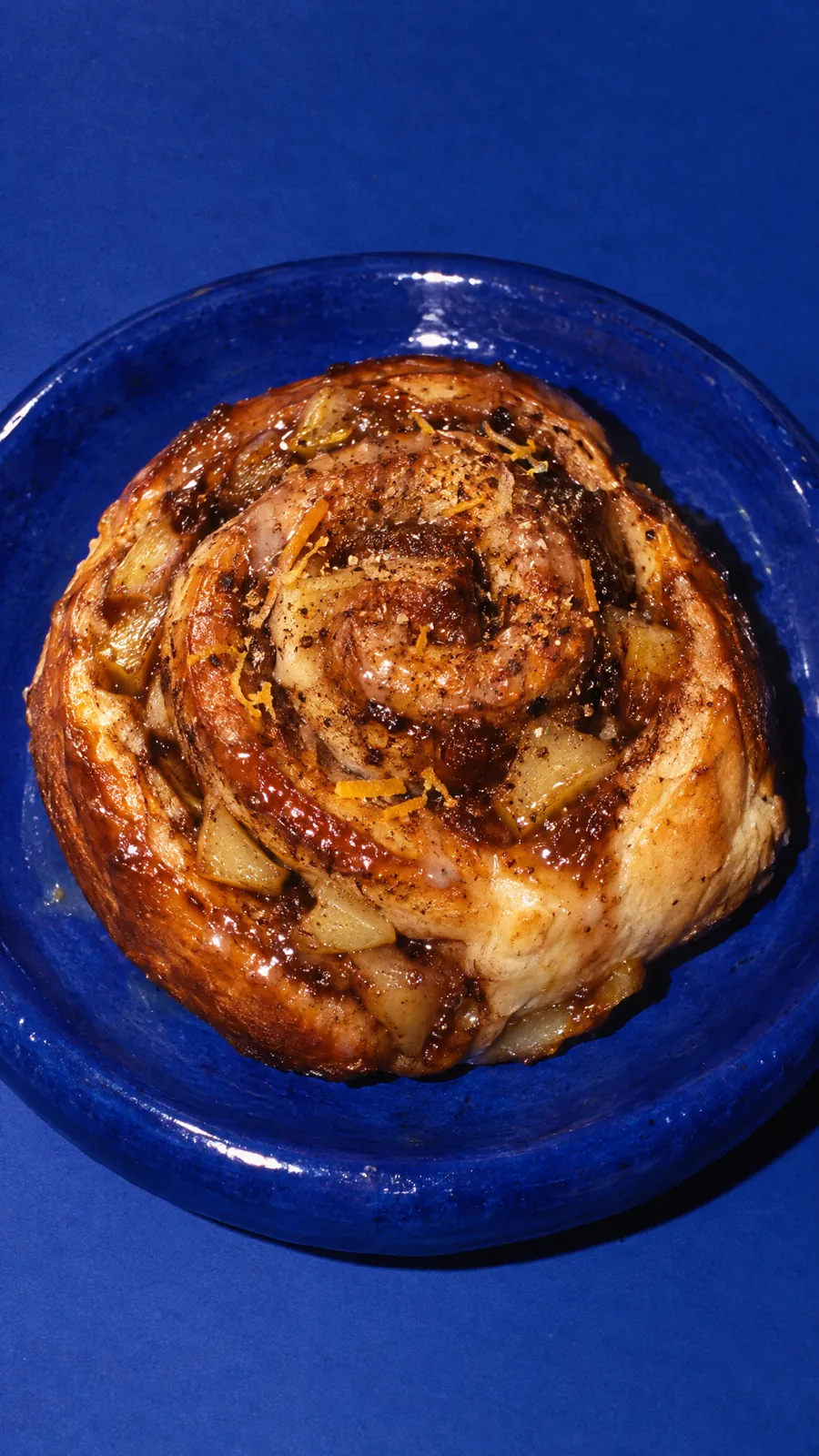
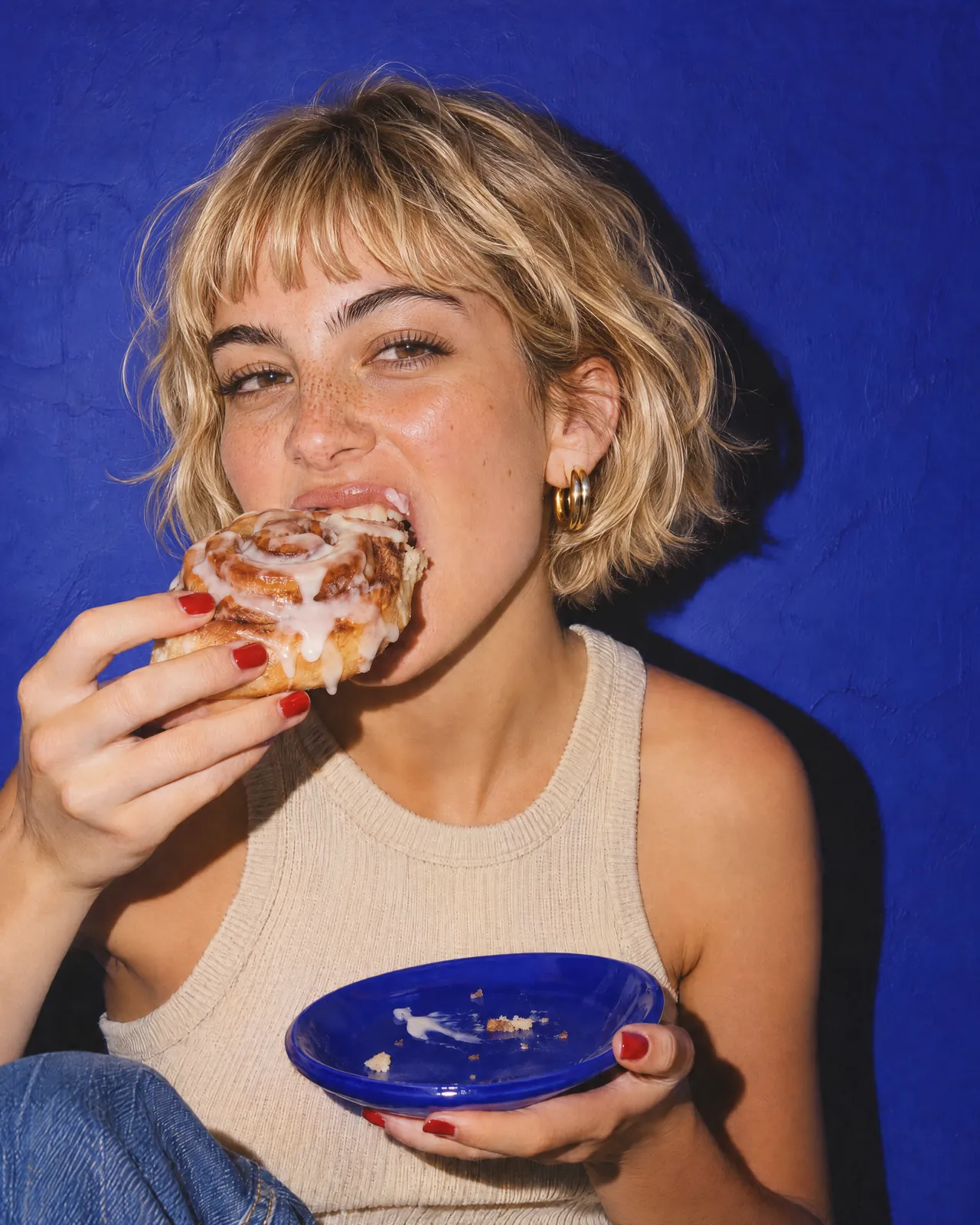
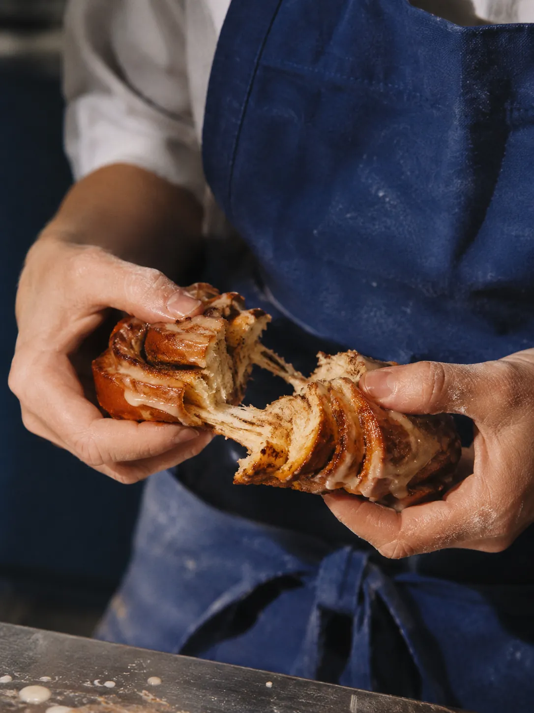
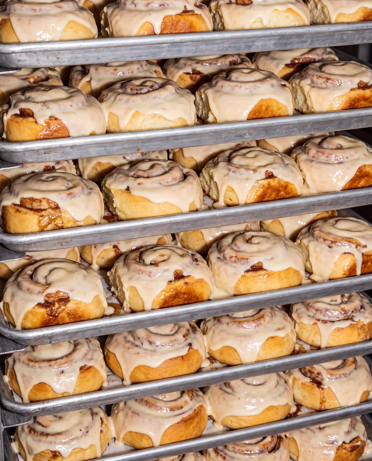
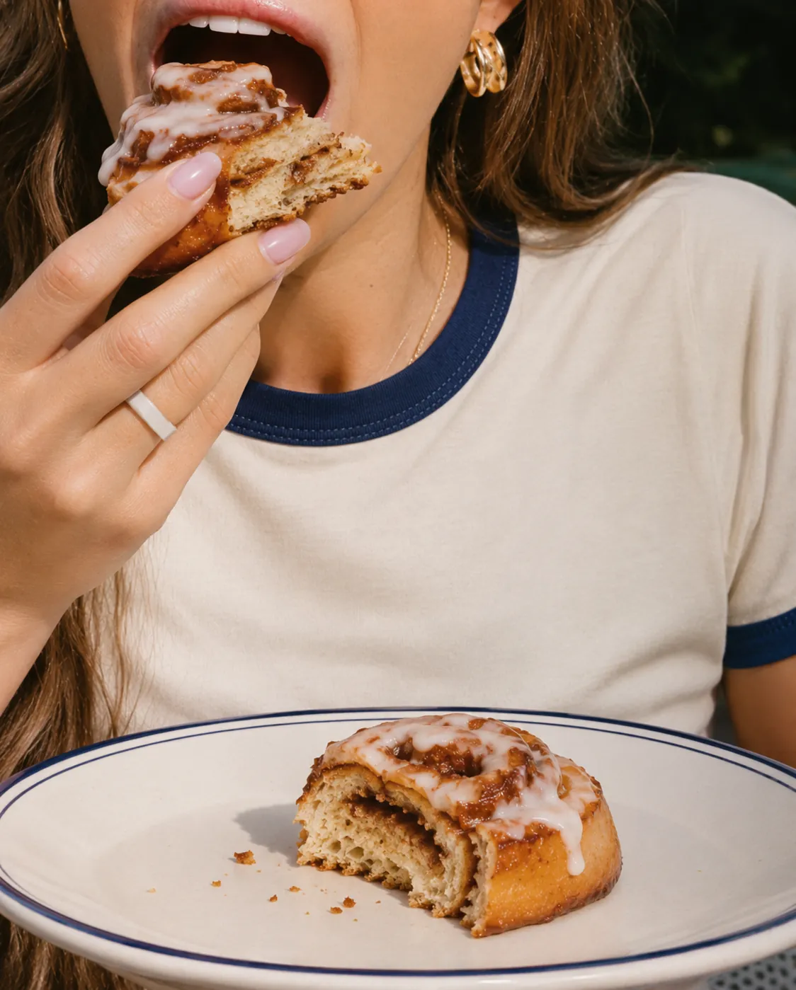
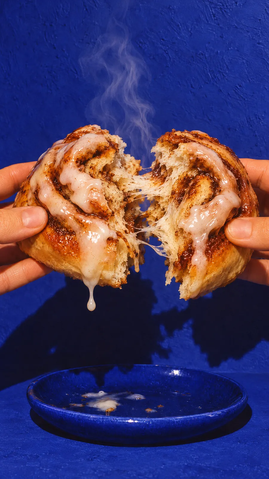
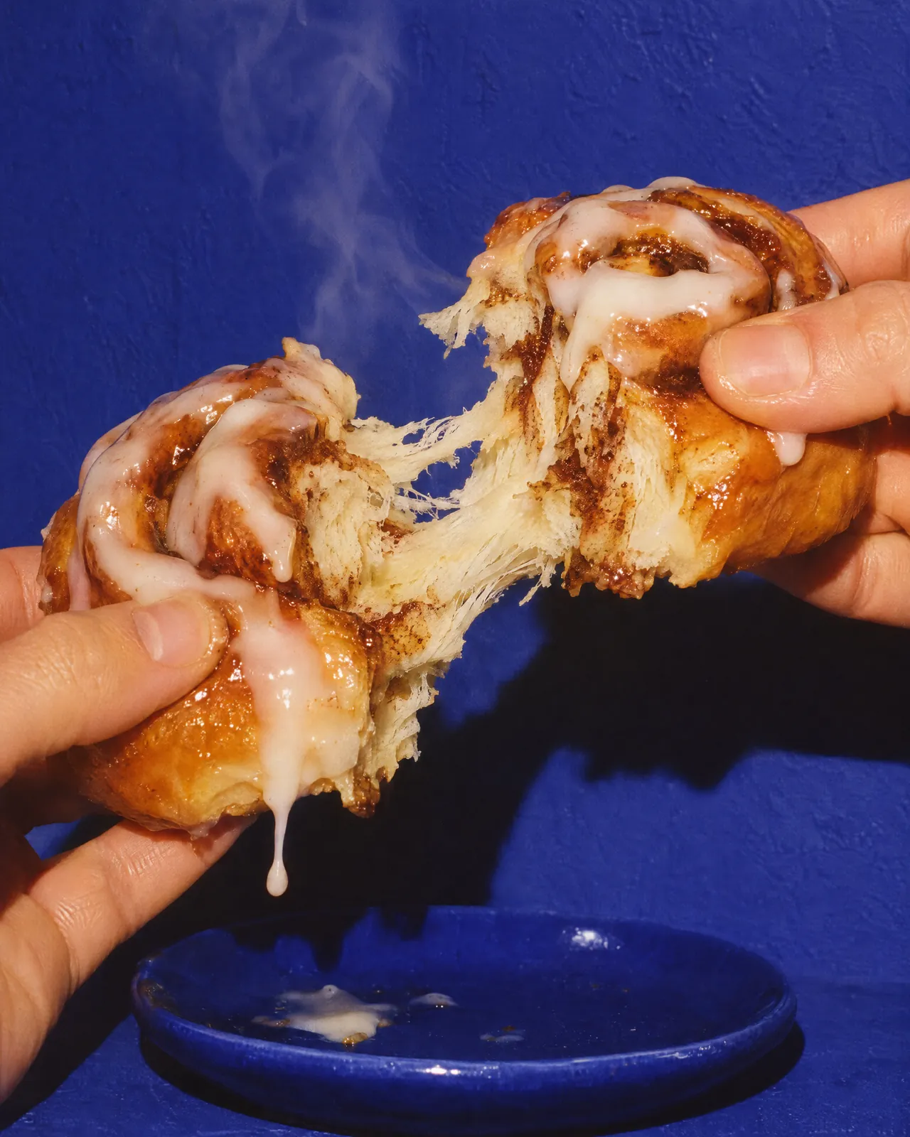
Bold ultramarine, warm hands, steam and glaze dripping off the edge. The imagery doesn’t show the perfect product shot, but the moment just before and after: the pull, the first bite, the full tray.
Plus short films, from dough to finished bun.
A shop in a single colour.
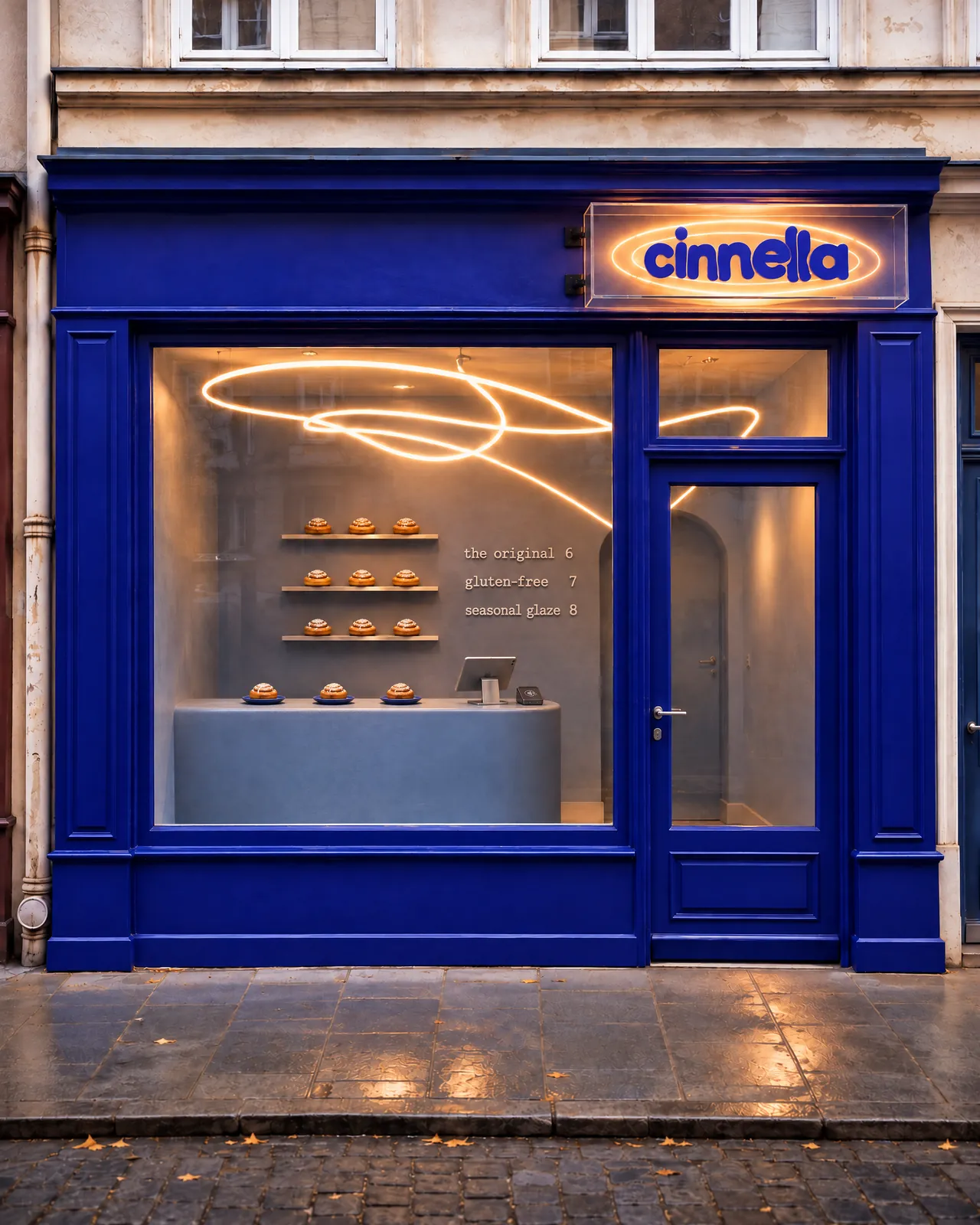
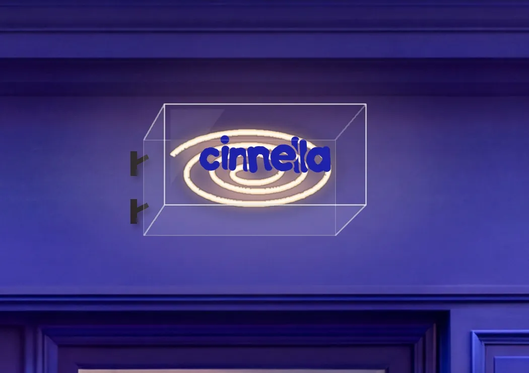
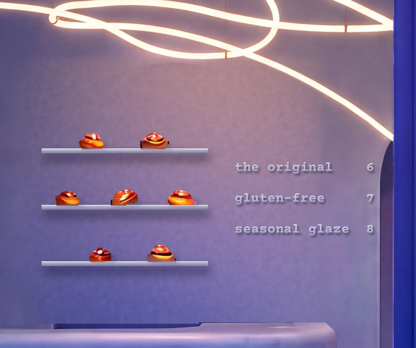
Outside, a façade in deep ultramarine and the logo as neon in a glass box. Inside, only what’s needed: no tiles, no decoration, two slim shelves, a round counter and three or four plates of buns.
Above it all, a single line of light swings through the room, like glaze running off a spoon. The menu has three lines: the original, gluten-free, seasonal glaze.
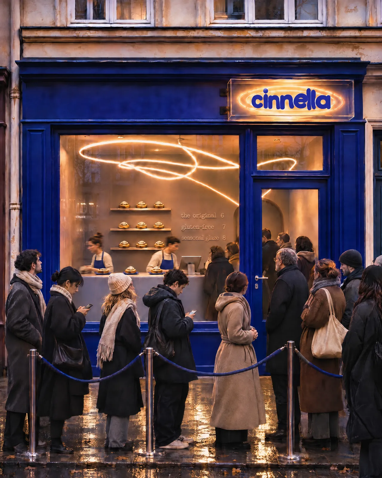
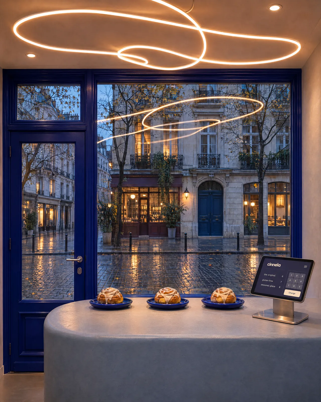
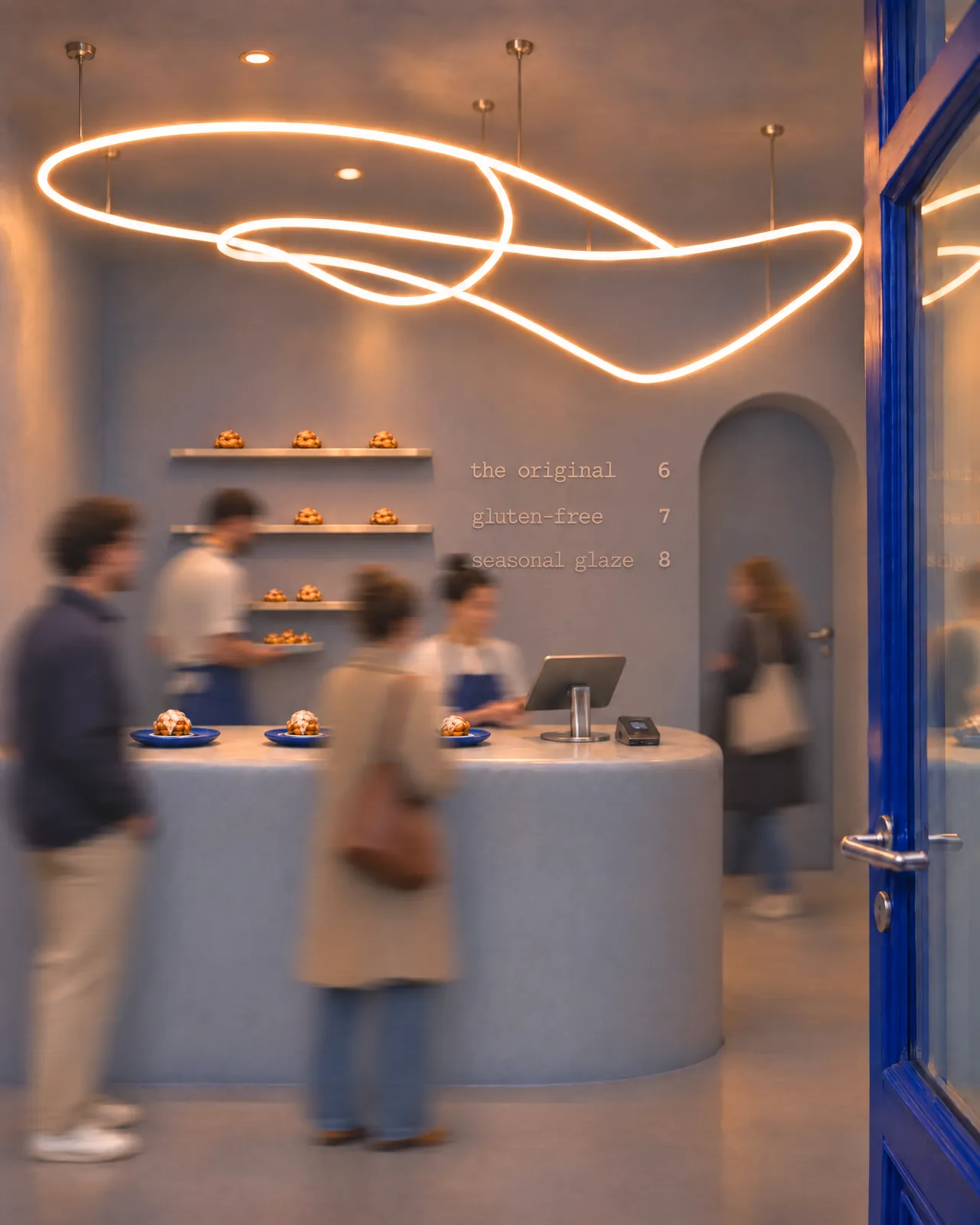
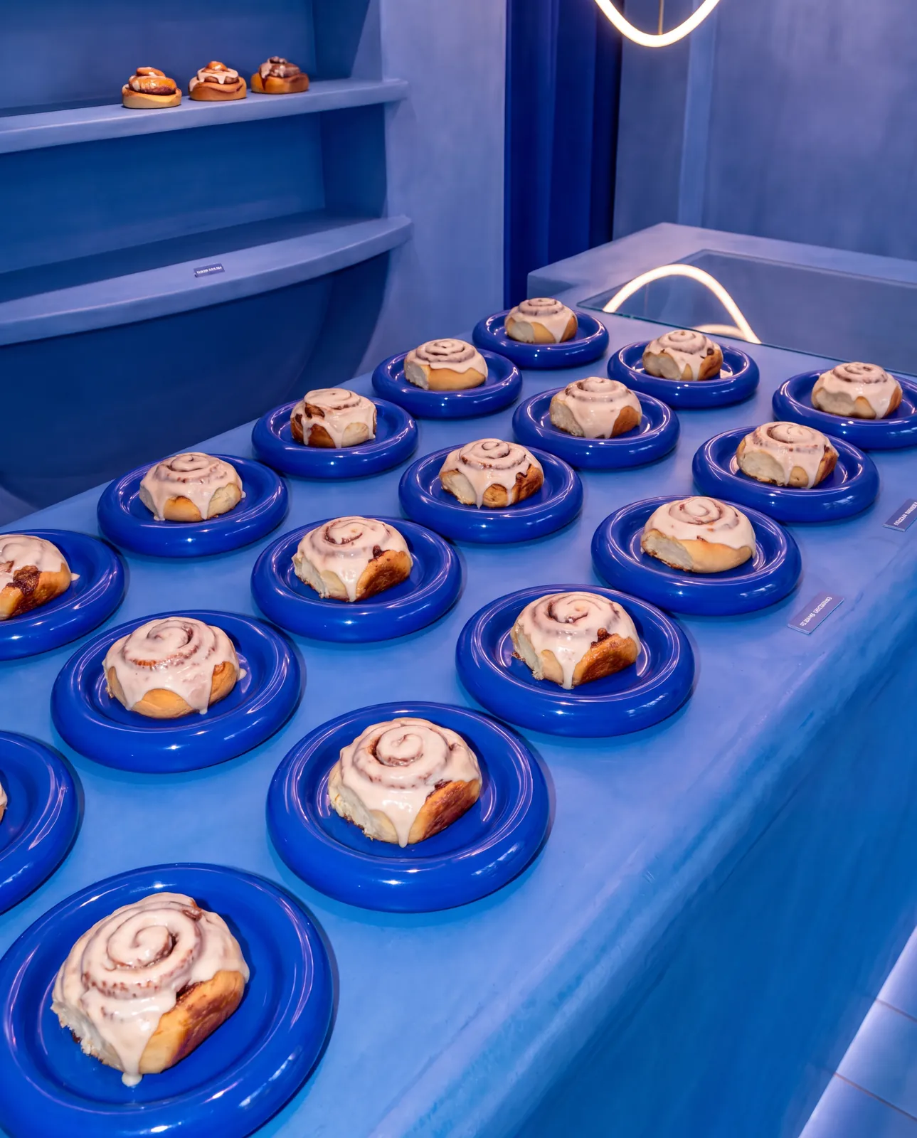
Scroll until the bun is done.
The website is a cinematic scroll. As you scroll, a bun comes to life: rolling the dough, cinnamon and sugar, rolling it up, baking, glazing. Filmed, not animated.
Then the menu, the location and boxes to pre-order, in the same typeface and the same blue as the shop.
A box you want to carry.
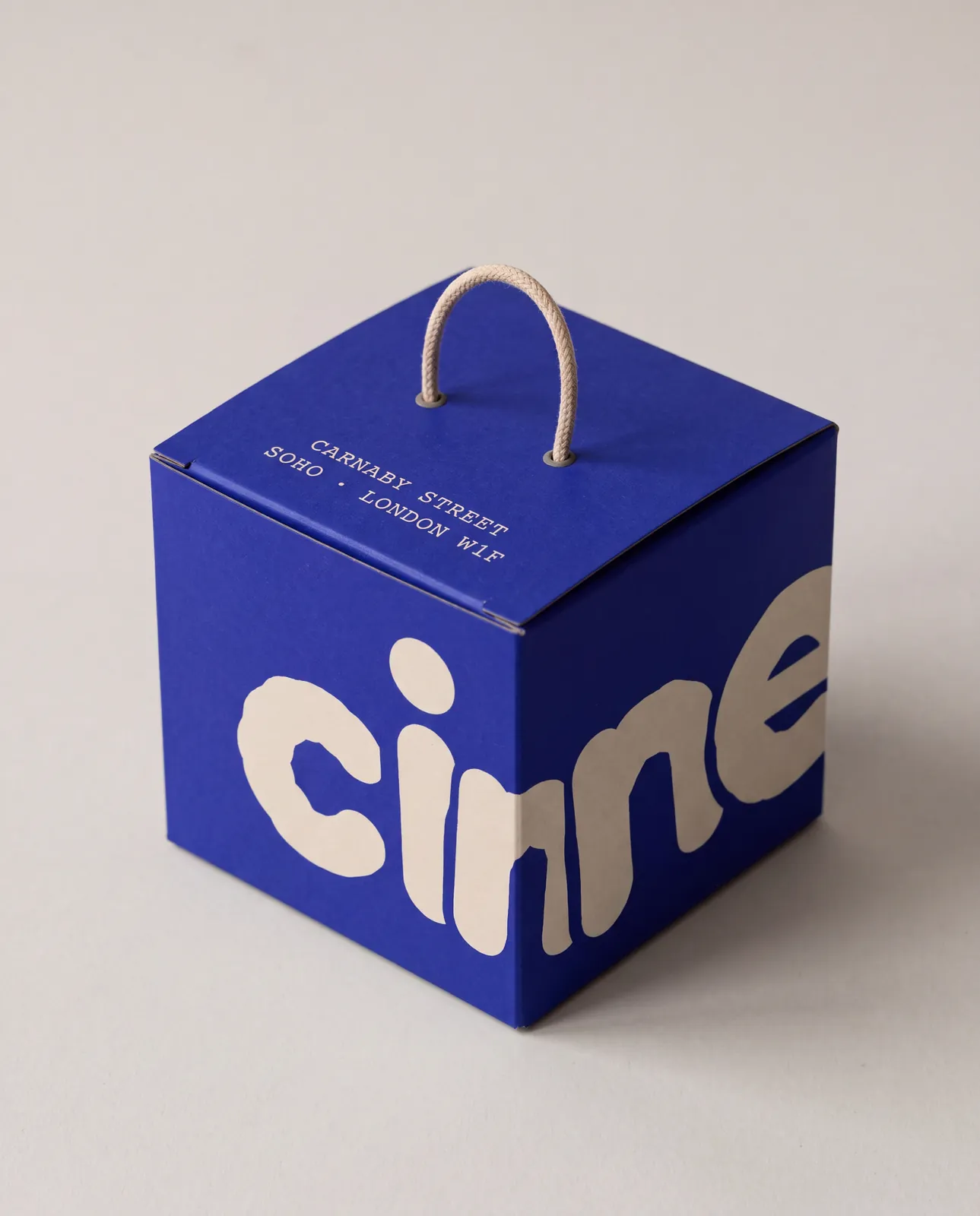
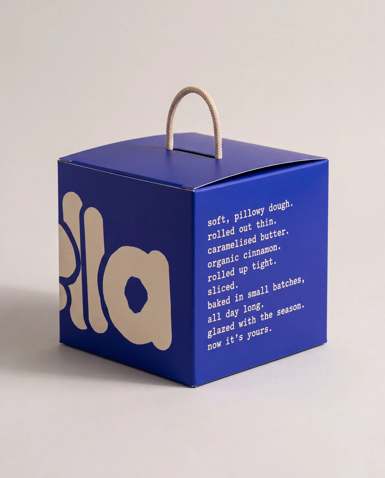
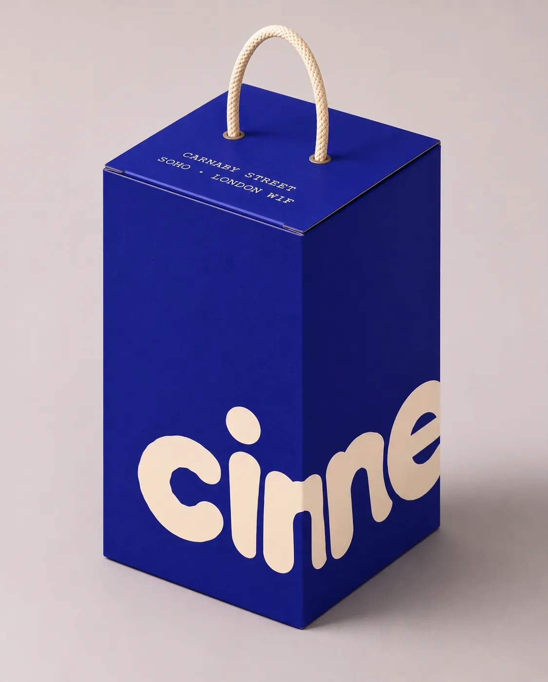
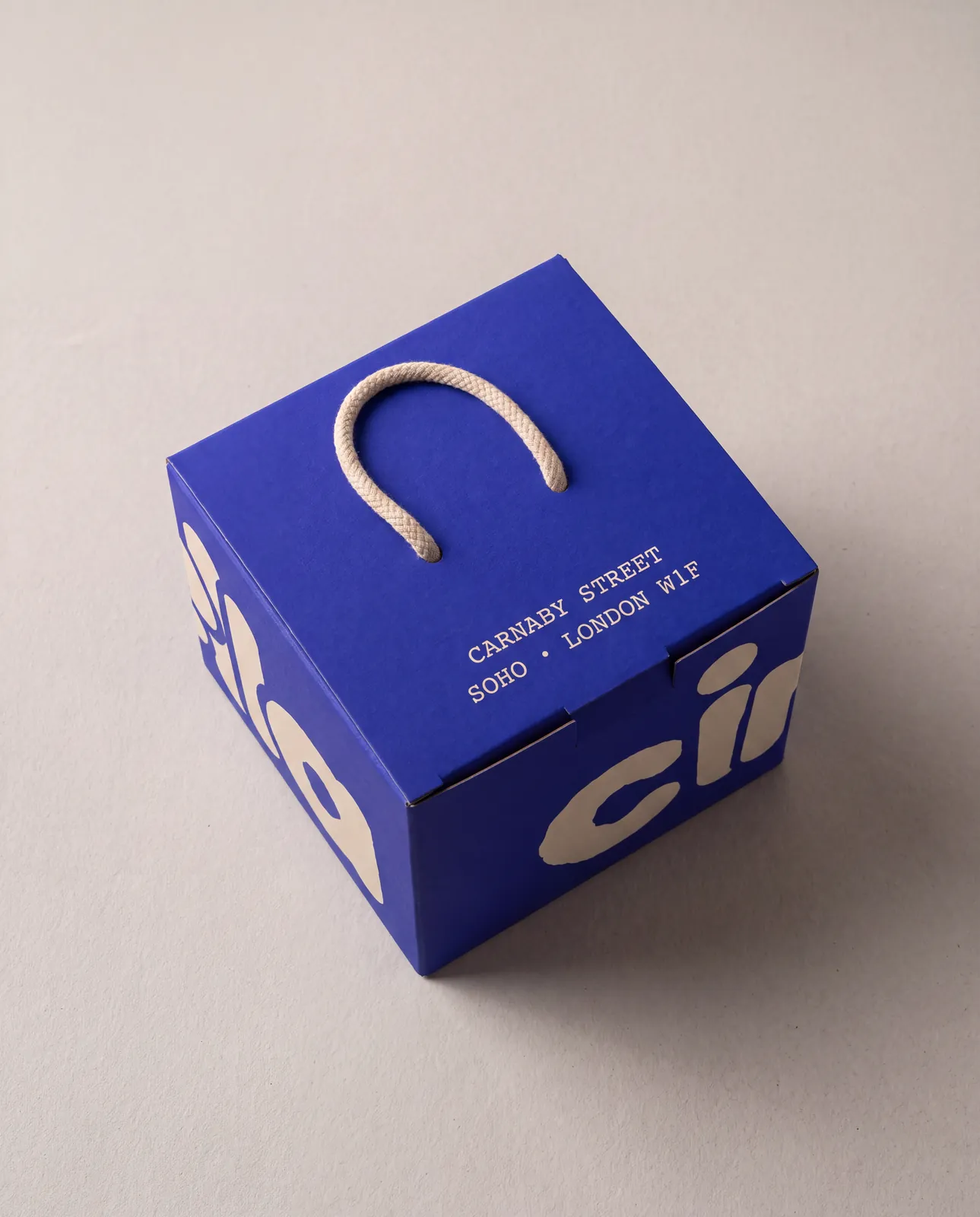
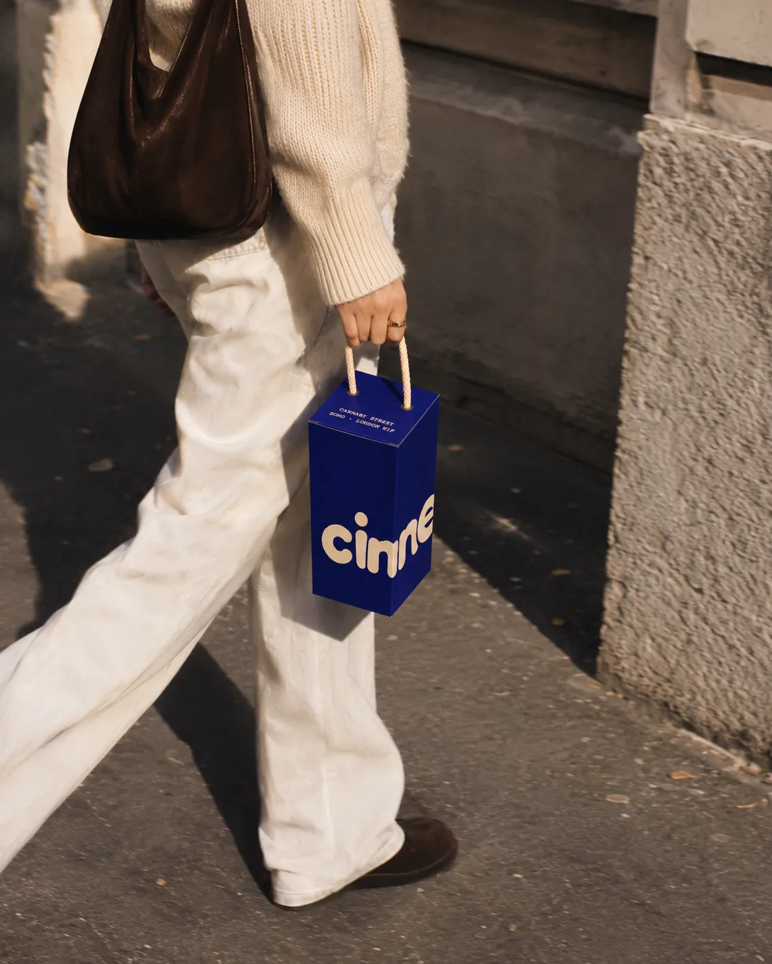
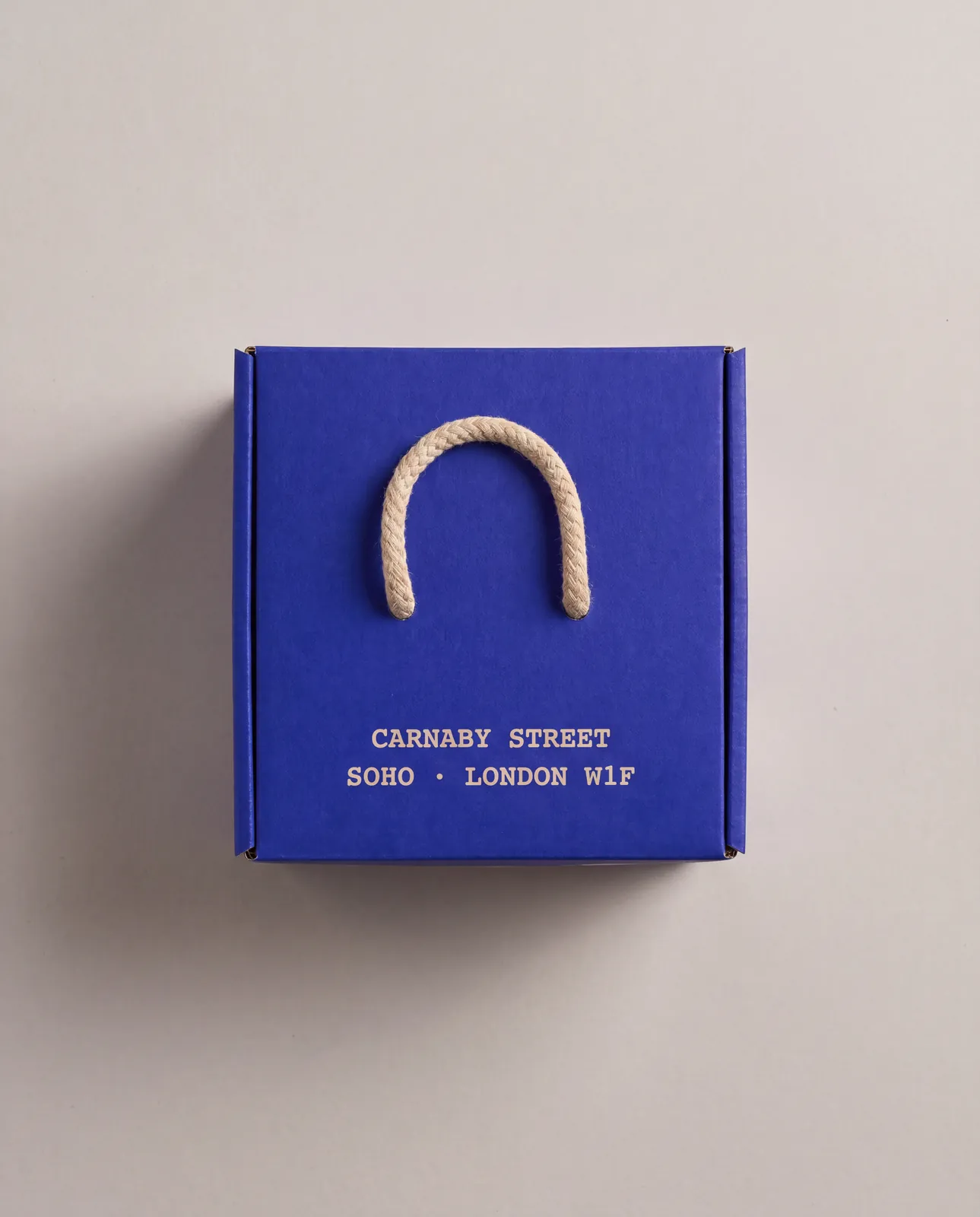
The boxes are ultramarine with a rope handle, and the logo wraps around the edge, so you only read it in full as the box turns.
One bun goes in the small box to take away. Take more and you get the large box: it grows upwards into a slim blue tower that holds up to four buns stacked on top of each other. Every glaze stays where it belongs, and the box still carries easily by its handle.
On the side, the recipe in a few lines: soft, pillowy dough. rolled out thin. caramelised butter. organic cinnamon. now it’s yours.
One idea, seven building blocks.
Type, logo, imagery, storefront, interior, website and packaging follow the same image and the same colour. See the box and you know the shop. Open the website and you can almost smell the bun.